-
Architects: 42mm Architecture
- Area: 4500 ft²
- Year: 2014
-
Photographs:Ravi Kanade
-
Manufacturers: BoConcept, Color Asian, D'Décor, Euro Plak, Hafele, Kohler, Oscar Lucia, Smart Home
-
MEP: Suved Encon, Tech Consultants

Text description provided by the architects. Brief was primarily an extension the already existing house: to accommodate a home theater / lounge / pool / changing room /a gym / and addition of two suites with dressers and toilets.

We strongly felt that the new block should be a standalone structure complementing the existing building and not replicating the same. We suggested to the clients to revisit their brief and to give this annexe block a refreshing look that makes it stand apart from its older structure.

Other reason that reinforced our suggestion- The landscape of the site, where the property is located, is breathtaking, lush green vegetation with tall trees. It was logical that the design of the house should appreciate that landscape at every turn.
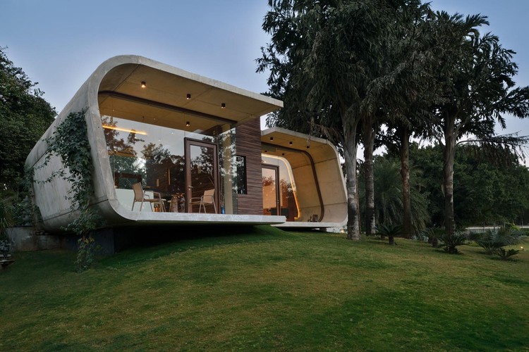
Inspiration behind the design “PEBBLE IN THE GRASS”Response to the context in terms of the existing architecture:- a post modern building constructed in exposed concrete about 20 years old. We constructed a new contradictory form in the same material system, expressing the shift in time between both the buildings.

-Building is like an object / a sculpture not bound by any classical archetypal or conventional construction system. The form is just like a natural peal from the landscape.
-The pool house is overlooking the green, its perched, the construction system is shell based so cantilevering the block was not a challenge, imagine the unit to be like a sliced section of a pipe its so strong in it self due to prestress that minor stresses and strains are inconsequential.

-In theory the building had to be a very bold statement for it to read as an object, so we decided to keep it very singular in its form and finish. The softening of its edges and the tilt were a result of trying to blend this stark object with the scape (imagine a lone pebble in the grass. It looks distinct / beautiful and yet blends in.

-The central wooden block is the life line A/C units / electric panels / toilet / pantry / storage for more that 2000 DVD’s / the AV system / the acoustic divider/ this unit is cladded in wooden finished HPL to achieve the singular look.

-In order to align with the architectural vocabulary the interior design had to be singular as well. The wooden paneling forms a floating media unit completely concealing all the devices and screen; this how ever is reciprocated with a curved panel on the other side defining the seating space with the island bar.

-All the furniture was sourced, it is what we like to call interior design by assembling ( these are all individual separate pieces with absolutely no relation what so ever with each other in terms of design or color or material, kept together to create a “whole” it feels like that they all belong together. )

Execution challenges- The entire building is an example of minimalism, every unwanted thing is either concealed / embedded or invisible:- This required extreme Detailing at a principal level :
-Designing shuttering to hold an inclined RCC wall weighing 8.5 Tons: we made a proper unit like a 3D frame to hold the weight of concrete.

-Getting fair faced concrete good enough to be able to handle polishing on the floor.
-Designing wooden frames in a curved section with wooden doors surrounded by glass on all sides: this was an experiment where we developed a freestanding wooden door frame.

-The toilet is finished in singular in-situ terrazzo, we had to get masons from eastern UP who work on doubly curved terrazzo surfaces.

Its an all concrete shell construction, no beams, no columns just a wrapping shell in concrete. The floor is the same concrete polished. It has no plaster / paint / waterproofing or finishing render. The interiors a bare with just a single block cladded in wood internally and externally housing a toilet and a pantry. The toilet is finished in terrazzo cast in-situ, the concrete used is a designed mix without and artificial pigments and enhancers we wanted the concrete to breathe and weather naturally.


